The Los Angeles Lakers are one of the NBA's premier franchises. With a record-tying 17 NBA championships, the Lakers brand is among the biggest in the world.
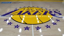
The Lakers' logo originated in Minneapolis, Minnesota in 1946 as a way to pay homage to the more than 10,000 lakes located in the state. When the team moved to Los Angeles in 1960, the logo changed to the purple lettering in front of a gold basketball that we all know and love today.
At center court of Crypto.com arena, the Lakers logo is front and center surrounded by 17 stars to represent the 17 NBA titles the team has won. The logo has changed slightly over the years, but for the most part has remained the same since 1961.
Get top local stories in Southern California delivered to you every morning. Sign up for NBC LA's News Headlines newsletter.
Here in Los Angeles, we're a little bias. Obviously, we believe the Lakers have the best logo in the entire NBA, but is that what the rest of the country thinks?
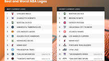
In a recent survey conducted by Onlinebetting.com, more than 1,000 people across the United States were asked which NBA team has the best logo.
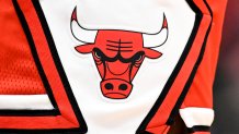
Thanks largely part in part to the great Michael Jordan, the Chicago Bulls topped the list. The red and black logo with the angry bull is not only internationally recognized, it's classic, timeless, and intimidating. The logo hasn't changed since 1966, and after this most recent survey, it's doubtful it will change any time soon.
Speaking of intimidating, the survey conductors asked that very question to participants. Naturally, Chicago came out on top. This one seems easy to decide as the angry red bull in Chicago's classic logo has bloody horns and looks not only mean, but menacing.
The Charlotte Hornets, Boston Celtics, Minnesota Timberwolves, and Los Angeles Lakers rounded out the top 5 best NBA logos, according to the survey.
Even though the Celtics were ranked as having the third best logo in the NBA (ahead of the Lakers), their logo was voted overwhelmingly as the worst logo in the entire NBA. I guess it turns out Lucky the Leprechaun isn't so lucky after all. The Brooklyn Nets were the runner-up for worst logo in the NBA, with the Detroit Pistons finishing a close third. The LA Clippers were voted as having the sixth-worst logo in the entire NBA.
Fans were also asked which NBA teams should consider a redesign of their logo, similar to what the Clippers did after Steve Ballmer bought the team back in 2015. Not that it will ever happen, but the Boston Celtics were once again voted number one as the team that needed to re-do their logo. The Detroit Pistons finished second followed by the Nets, Hawks, and Thunder.

In addition to which NBA teams needed to redesign their logo, the surveyors asked participants if they had a favorite logo from any NBA team that is no longer currently being used. Among the participants favorite retro NBA logos, the Toronto Raptors featuring the red velociraptor dribbling a basketball that was used by the team from 1995 to 2008 was voted number one. After the Raptors, the Charlotte Hornets logo from 1988 to 2002 of a sneaker-wearing hornet dribbling a basketball finished second, and the Denver Nuggets logo of the rainbow colored downtown skyline that was used from 1988 to 1993 finished third.
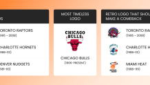
The Miami Heat's logo of a black ring floating above a flaming basketball that was used from 1988 to 1999 finished fourth, but was selected in the top three of logos that need to be brought back by the current Heat team.
Local
Get Los Angeles's latest local news on crime, entertainment, weather, schools, COVID, cost of living and more. Here's your go-to source for today's LA news.
Finally, participants in the survey were also asked about which NBA team's logo had the best colors. The colors used in a logo are similar to what is worn by the players on their jerseys, but the palette is an important part of what makes or breaks a logo, and also an identifying factor of the city that hosts them.
The Los Angeles Lakers iconic purple and gold colors were selected as the third best color scheme in the entire NBA. The Charlotte Hornets with their unique combination of white, teal, grey, and dark purple finished first. The timeless red and black Chicago Bulls logo finished second.
The Atlanta Hawks were voted as having the worst colors in the NBA as fans were apparently not fans of the red, yellow, and black combination. The Brooklyn Nets had the second-worst colors, and the Celtics green and white finished third-worst.
For a complete list of the best and worst NBA logos check out the image below, and If you want to take a look at all of the NBA logos yourself, or any professional sports teams logo for that matter, head over to www.sportslogos.net.
